Pengalaman Belajar Fisika di SMAN BI 1 Banjar
Ada Apa Dengan Fisika?
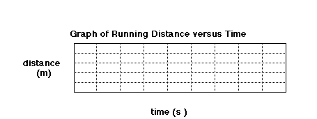
Lesson Plan: Graphing Data from a Spreadsheet
SUBJECT: Technology
TOPIC: Presenting Data
DESCRIPTION: A set of problems dealing with graphing data.
CONTRIBUTED BY: Carol Hodanbosi
EDITED BY: Jonathan G. Fairman - August 1996
Purpose:
To graph real data to input into a computer spreadsheet
Objective:
To illustrate a distance versus time graph using student data from running various distances.
To illustrate a distance versus time graph using student data from running various distances.
Materials:
- computer spreadsheet with data from previous lab activity
- computer graphing utility
Procedure:
- Each student will be graphing the average of their classes running speed data, putting distance (from 0 meters to 20 meters on the vertical or Y axis, and time on the X axis ( in seconds), in 0.1 second intervals.
- Plot the values for your class, using the average time for the 5, 10, and 15 meter distances.
- Plot a fourth point using a zero distance, and estimating what the time would be for that distance.
- Draw a straight, best-fit line through the data points.
- Using the points for the 15 meter time and the zero point as endpoints, calculate the slope of the line segment.
- What does the slope represent?
- Can you predict the slope of the line if the distance were extended to a much greater value, such as 10,000 meters (10k), or 40,000 meters?
Sumber:
NASA